|
|
< Day Day Up > |
|
14.1 Extending an Existing ComponentThe preferences screens for the sample application we developed in Chapter 9 are not all that user friendly. For instance, you can see the different setting only by navigating through the screens in a fixed order; you can't jump simply from one setting to another. This type of data is better presented as tabs on one screen, as shown in Figure 14-1. Figure 14-1. User preferences as tabs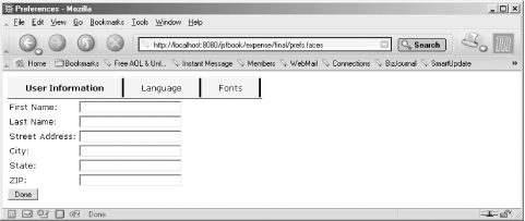 Much of what is needed for this design can be done with existing components. The contents of each tab can be represented by a panel component, e.g., with the <h:panelGroup> or <h:panelGrid> action elements. Yet another panel can hold the whole set of tabs together, but it needs a custom panel renderer that ensures that only the currently selected tab panel is rendered. The same custom renderer can also create the tab control bar, and pick up the tab label texts or images from facets attached to each tab panel. The part of the design that makes sense to implement as a custom component is the tab label. Clicking on the label should result in the rendering of the corresponding tab panel's content, so the label component must act as a command component with built-in event handling behavior, toggling the rendered attribute for the panels that make up the individual tabs. Example 14-1 shows parts of the JSP page that creates a view based on this design with panels, a custom renderer, and a custom component for the labels. Example 14-1. Preferences as tabs (expense/final/prefs.jsp)<%@ page contentType="text/html" %>
<%@ taglib uri="http://java.sun.com/jsf/html" prefix="h" %>
<%@ taglib uri="http://java.sun.com/jsf/core" prefix="f" %>
<%@ taglib uri="http://mycompany.com/jsftaglib" prefix="my" %>
<f:view locale="#{userProfile.locale}">
<f:loadBundle basename="labels" var="labels" />
<html>
<head>
<title><h:outputText value="#{labels.prefLinkLabel}" /></title>
<link rel="stylesheet" type="text/css"
href="${pageContext.request.contextPath}/style.css">
</head>
<body>
<h:form>
<my:panelTabbed labelAreaClass="labels"
selectedLabelClass="selected-tab" unselectedLabelClass="tab">
<h:panelGrid columns="2">
<f:facet name="label">
<my:tabLabel>
<h:outputText value="#{labels.prefUserHeader}" />
</my:tabLabel>
</f:facet>
<h:outputText value="#{labels.firstNameLabel}" />
<h:inputText size="30" value="#{userProfile.firstName}" />
<h:outputText value="#{labels.lastNameLabel}" />
<h:inputText size="30" value="#{userProfile.lastName}" />
...
</h:panelGrid>
<h:panelGrid columns="2">
<f:facet name="label">
<my:tabLabel>
<h:outputText value="#{labels.prefLangHeader}" />
</my:tabLabel>
</f:facet>
...
</h:panelGrid>
<h:panelGrid columns="2">
<f:facet name="label">
<my:tabLabel>
<h:outputText value="#{labels.prefFontHeader}" />
</my:tabLabel>
</f:facet>
...
</h:panelGrid>
</my:panelTabbed>
<h:commandButton value="#{labels.doneButtonLabel}"
action="#{userHandler.updateProfile}" />
</h:form>
</body>
</html>
</f:view>
The <my:panelTabbed> action element creates the main panel with a custom renderer. Within this element, there's one <h:panelGrid> element per preference type (user information, language, and font selections). Each such panel is configured with a facet named label, consisting of a custom component created by a <my:tabLabel> action element. The custom tab label component uses the output generated by its children as the content of a link it renders as the tab label. Here I use a simple output component, but you can use <h:graphicImage> instead if you want to use an image as the label. All in all, we need to develop a custom renderer for the outer panel, a custom component and a renderer for the tab control label, and custom actions for both component/renderer combinations. We must also register the custom component and the two custom renderers. 14.1.1 The TabbedRenderer ClassLet's look at the custom renderer for the panel that contains all the tabs first. It's a class called com.mycompany.renderer.TabbedRenderer: package com.mycompany.jsf.renderer;
import com.mycompany.jsf.component.UITabLabel;
import java.io.IOException;
import java.util.Iterator;
import java.util.List;
import javax.faces.context.FacesContext;
import javax.faces.context.ResponseWriter;
import javax.faces.component.UIComponent;
import javax.faces.component.UIViewRoot;
import javax.faces.render.Renderer;
public class TabbedRenderer extends Renderer {
public boolean getRendersChildren( ) {
return true;
}
public void decode(FacesContext context, UIComponent component) {
Iterator i = component.getChildren( ).iterator( );
while (i.hasNext( )) {
UIComponent child = (UIComponent) i.next( );
if (!child.isRendered( )) {
UITabLabel tabLabel = (UITabLabel) child.getFacet("label");
if (tabLabel != null) {
tabLabel.processDecodes(context);
}
}
}
}
public void encodeBegin(FacesContext context, UIComponent component)
throws IOException {
if (!component.isRendered( )) {
return;
}
int selected = 0;
List children = component.getChildren( );
boolean pickedSelected = false;
for (int i = 0; i < children.size( ); i++) {
UIComponent child = (UIComponent) children.get(i);
if (child.isRendered( ) && !pickedSelected) {
selected = i;
pickedSelected = true;
}
else {
child.setRendered(false);
}
}
String labelAreaClass =
(String) component.getAttributes( ).get("labelAreaClass");
String selectedLabelClass =
(String) component.getAttributes( ).get("selectedLabelClass");
String unselectedLabelClass =
(String) component.getAttributes( ).get("unselectedLabelClass");
ResponseWriter out = context.getResponseWriter( );
out.startElement("table", component);
if (component.getId( ) != null &&
!component.getId( ).startsWith(UIViewRoot.UNIQUE_ID_PREFIX)) {
out.writeAttribute("id", component.getClientId(context),
"id");
}
if (labelAreaClass != null) {
out.writeAttribute("class", labelAreaClass, "labelAreaClass");
}
out.startElement("tr", component);
for (int i = 0; i < children.size( ); i++) {
UIComponent child = (UIComponent) children.get(i);
UITabLabel tabLabel = (UITabLabel) child.getFacet("label");
if (tabLabel != null) {
String styleClass = i == selected ?
selectedLabelClass : unselectedLabelClass;
out.startElement("td", component);
if (styleClass != null) {
out.writeAttribute("class", styleClass,
i == selected ?
"selectedLabelClass" : "unselectedLabelClass");
}
encodeRecursive(context, tabLabel);
out.endElement("td");
}
}
out.endElement("tr");
out.endElement("table");
}
public void encodeChildren(FacesContext context, UIComponent component)
throws IOException {
Iterator i = component.getChildren( ).iterator( );
while (i.hasNext( )) {
UIComponent child = (UIComponent) i.next( );
if (child.isRendered( )) {
child.encodeBegin(context);
if (child.getRendersChildren( )) {
child.encodeChildren(context);
}
child.encodeEnd(context);
}
}
}
private void encodeRecursive(FacesContext context, UIComponent component)
throws IOException {
if (!component.isRendered( )) {
return;
}
component.encodeBegin(context);
if (component.getRendersChildren( )) {
component.encodeChildren(context);
} else {
Iterator i = component.getChildren( ).iterator( );
while (i.hasNext( )) {
UIComponent child = (UIComponent) i.next( );
encodeRecursive(context, child);
}
}
component.encodeEnd(context);
}
}
This class should look familiar. It's very similar to the renderer classes we developed in Chapter 13. The decode() method is needed to override the default behavior of decoding only components that has the rendered property set to true. Only the tabbed panel child representing the currently selected tag has rendered set to true, but the tab label facets for all children must still be decoded in order to react when the user selects a new tab. The custom decode( ) method therefore decodes the facets for all children with rendered set to false; the default behavior ensures that the facet for the currently selected tab is decoded. The encodeBegin() method figures out which child tab component to render by iterating through all children and selecting the first one with rendered set to true. It then sets rendered to false for all the others. I do this to ensure that only one tab panel is rendered the first time the view is rendered, even if the page author has used the default value of true for the rendered attribute on all tab panels. With one of the tab panels selected as the current tab, it's time to render the tab labels. The TabbedRenderer uses different CSS classes: one for the selected tab label and one for the other tab labels, specified by the selectedLabelClass and unselectedLabelClass attributes. The page author can use different styles to give the user a visual cue about which one is currently selectedfor instance, a bold font for the selected tab. The renderer also supports a labelAreaClass attribute for a CSS class applied to the whole label area. It can be used for setting a background color or border properties. The encodeBegin() method writes a <table> element with the labelAreaClass as the class attribute value. It then writes one row (a <tr> element) with one <td> element per tab with either the selectedLabelClass or the unselectedLabelClass as the class attribute value. It renders the tab panel's label facet as the content of the <td> element by calling the encodeRecursive() method, which is implemented the same way as it is in the examples in Chapter 13. The encodeChildren() method just iterates through all children and renders the one with rendered set to true. The TabbedRender must also be registered in the faces-config.xml file, as described in Chapter 13: the component family name is javax.faces.Panel and the renderer type is com.mycompany.Tabbed. A tag handler for the <my:panelTabbed> custom action is also needed. It's implemented as a class named com.mycompany.jsf.taglib.PanelTabbedTag. The tag handler class follows the same pattern as the tag handlers we looked at in Chapter 13 and it's included with the source code for all examples, so I suggest that you look at it on your own. 14.1.2 The UITabLabel ClassWith the custom renderer out of the way, let's see how to develop a custom component. The custom component needed for the tab labels is implemented as a class named UITabLabel: package com.mycompany.jsf.component;
import java.util.Iterator;
import javax.faces.component.UICommand;
import javax.faces.component.UIComponent;
import javax.faces.el.MethodBinding;
import javax.faces.event.ActionEvent;
import javax.faces.event.ActionListener
import javax.faces.event.FacesEvent;
public class UITabLabel extends UICommand {
public static final String COMPONENT_TYPE = "com.mycompany.TabLabel";
public static final String COMPONENT_FAMILY = "javax.faces.Command";
public UITabLabel( ) {
super( );
setRendererType("javax.faces.Link");
}
public String getFamily( ) {
return COMPONENT_FAMILY;
}
All JSF components must extend the abstract UIComponent class, either directly or indirectly by extending a subclass. A subclass with default implementations for all methods is called UIComponentBase, and all top-level standard components extend this class instead of UIComponent. The custom UITabLabel class extends the UICommand class because its behavior is the same as the standard command component with just a few twists. The COMPONENT_TYPE and COMPONENT_FAMILY constants are not required, but they are defined by convention in all standard JSF component classes, so I do the same for the custom component. They hold the component type and component family identifiers for the component. The constructor sets the renderer type for the component to javax.faces.Link. Combined with a getFamily() method that returns javax.faces.Command, this means that the custom component is associated with the standard link renderer for a command component. UIComponentBase methods call the getFamily() and the getRendererType( ) methods when a renderer is needed and use the returned values to get an instance of the renderer class registered for the combination of the renderer type and component family. A standard link renderer is exactly what I want for this custom component, because it should behave exactly as a command link except that the custom component should handle the ActionEvent fired when the user clicks the link in a custom way. This custom behavior is achieved by overriding the broadcast() method: public void broadcast(FacesEvent event) {
if (event instanceof ActionEvent) {
processAction((ActionEvent) event);
}
}
JSF calls the broadcast() method of a component for which an event is queued to let the component notify all its listeners. The default implementation of broadcast( ) in UIComponentBase notifies all registered listeners of the event, and the UICommand specialization of this method also invokes the methods defined by the action and actionListener properties. For the tab label custom component, however, I want to prevent the developer from using listeners or action methods to process the event, because the component represents a special-purpose command. The broadcast() method in UITabLabel therefore calls the private processAction() method to handle the event itself instead: private void processAction(ActionEvent event) {
UIComponent parent = getParent( );
UIComponent panelTabbed = parent.getParent( );
Iterator i = panelTabbed.getChildren( ).iterator( );
while (i.hasNext( )) {
UIComponent tab = (UIComponent) i.next( );
if (tab.equals(parent)) {
tab.setRendered(true);
}
else {
tab.setRendered(false);
}
}
}
The processAction() method locates the component's parent (the tab panel) and then the tab panel's parent (the outer panel with the tabbed renderer). It then asks the outer panel for all its children and iterates through them. When it encounters its own parent, it sets the parent's rendered property to true. For all other panels, it sets the rendered property to false. The effect is that when the outer panel next renders its children, it renders only the panel selected by the tab label custom component. The rest of the UITabLabel class consists of overridden methods inherited from the UICommand class, changed to prevent the developer from defining action and actionListener method bindings and registering action listeners for the component: public MethodBinding getAction( ) {
return null;
}
public void setAction(MethodBinding action) {
throw new UnsupportedOperationException( );
}
public MethodBinding getActionListener( ) {
return null;
}
public void setActionListener(MethodBinding actionListener) {
throw new UnsupportedOperationException( );
}
public void addActionListener(ActionListener listener) {
throw new UnsupportedOperationException( );
}
public ActionListener[] getActionListeners( ) {
return new ActionListener[0];
}
public void removeActionListener(ActionListener listener) {
throw new UnsupportedOperationException( );
}
}
These methods return null or an empty array, or throw an UnsupportedOperationException in case someone calls them. It's not an absolute requirement to implement these methods, because all listeners and action methods are ignored anyway. However, it may save someone from wondering why additional event handlers are not invoked, so it's worth the extra bytes. 14.1.3 Registering the ComponentAll custom components must be registered in the faces-config.xml file. Here's how you register the UITabLabel component: <faces-config>
...
<component>
<component-type>
com.mycompany.TabLabel
</component-type>
<component-class>
com.mycompany.jsf.component.UITabLabel
</component-class>
</component>
...
</faces-config>
The <component> element contains two mandatory nested elements. The <component-type> element assigns the component a unique identifier and the <component-class> holds the fully qualified component class name. As you may recall from Chapter 6, the code that creates components does so by calling the Application createComponent() method. It takes the component type identifier as the argument and returns an instance of the class mapped to the identifier. 14.1.4 The JSP Tag Handler ClassFinally, we need a tag handler for the <my:tabLabel> custom action. It's a very simple class: package com.mycompany.jsf.taglib;
import javax.faces.webapp.UIComponentTag;
public class TabLabelTag extends UIComponentTag {
public String getComponentType( ) {
return "com.mycompany.TabLabel";
}
public String getRendererType( ) {
return "javax.faces.Link";
}
}
The TabLabelTag class extends UIComponentTag, the same way as the tag handler classes we developed in Chapter 13. It implements the getComponentType() and getRendererType() methods to return the values needed by the superclass to create and configure the component. That's all, because this custom action doesn't provide any attributes for customization of the component or the renderer. |
|
|
< Day Day Up > |
|