4.2. SWT Widgets
SWT provides a rich set of widgets that can be used to create either stand-alone Java applications or Eclipse plug-ins. Before going into detail about each of the widgets you are likely to use, it is instructive to explore a simple standalone SWT example.
4.2.1. Simple stand-alone example
Let's start by revisiting the simple Java project and HelloWorld application created in Chapter 1, Using Eclipse Tools.
4.2.1.1. Adding SWT to your project's classpath
Before you can start using SWT, the SWT libraries need to be added to your project's classpath. To add SWT support, do the following:
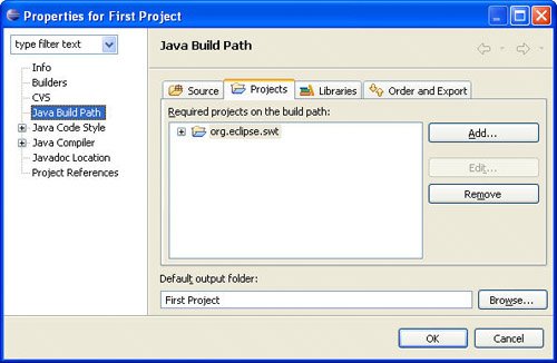
Download SWT for stand-alone applications. A standalone version of SWT is available on the same download page as the Eclipse SDK. Look for the section titled SWT Binary and Source. Do not extract the archive file, just save it to disk. Select File > Import... to open the Import wizard. Select Existing Projects into Workspace and click the Next button. Choose Select archive file and use the Browse... button to locate the SWT stand-alone archive that you just downloaded. Click the Finish button to finish importing the SWT project into your workspace. Right-click on the project and select the Properties command to open the Properties dialog. Select the Java Build Path > Projects tab and click the Add button. Select the org.eclipse.swt project and click OK to finish adding the SWT libraries to your project's classpath (see Figure 4-1).
4.2.1.2. Standalone SWT code
Next, modify the HelloWorld class to convert it into a standalone SWT example. To do this, remove the contents of the main() method and replace it with the following:
1   public static void main(String[] args) {
2      Display display = new Display();
3      Shell shell = new Shell(display);
4      shell.setText("Hello World");
5      shell.setBounds(100, 100, 200, 50);
6      shell.setLayout(new FillLayout());
7      Label label = new Label(shell, SWT.CENTER);
8      label.setText("Hello World");
9      Color red = new Color(display, 255, 0, 0);
10     label.setForeground(red);
11     shell.open();
12     while (!shell.isDisposed()) {
13        if (!display.readAndDispatch()) display.sleep();
14     }
15     red.dispose();
16     display.dispose();
17  }
Note
After entering the new method text, select the Source > Organize Imports command (or press Ctrl+Shift+O) to add imports for all the referenced SWT classes.
The following examines each line in detail.
Line 2Each SWT-based application has one Display instance that represents the link between the underlying platform and SWT. In addition to managing the SWT event loop, it also provides access to the platform resources SWT needs. It will be disposed in Line 16.
Line 3Each window has a Shell representing the window frame with which the user interacts. It handles the familiar moving and sizing behavior common to all windows and acts as the parent for any widgets displayed within its bounds.
Line 4The setText() method is used to set the title of the window frame.
Line 5The setBounds() method is used to set the size and position of the window frame. In the example, the window frame will be 200 pixels wide, 50 pixels tall, and will be positioned 100x100 pixels from the top left corner of the screen.
Line 6The setLayout() method sets the layout manager for the window frame. FillLayout is a simple layout that causes the single child widget to fill the entire bounds of its parent. SWT layout managers will be discussed in detail in Section 4.3, Layout Management, on page 170.
Line 7This creates a simple label widget that has the shell as its parent and will display its text centered relative to itself.
Line 8The setText() method is used to set the text of the label.
Line 9This creates a Color instance with the color red. Note that you could use the red system color here as well:
Color red = display.getSystemColor(SWT.COLOR_RED);
Line 10The setForeground() method sets the foreground color of the label.
Line 11Up to this point, the window frame has not been visible. The open() method causes it to appear.
Line 12The while loop continually checks whether the window frame has been closed.
Line 13The display manages the event loop. The readAndDispatch() method reads events from the platform's event queue and dispatches them to the appropriate receiver. The method returns true as long as there is more work to be done and false when the event queue is empty (thus allowing the UI thread to sleep until there is more work to be done).
Lines 15 and 16When the loop detects that the window has been disposed, it is necessary to dispose of the color, display, and any associated platform resources. Note that system colors should not be disposed.
4.2.1.3. Running the example
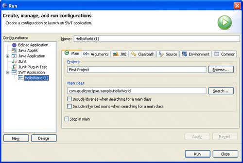
Normally, to launch a Java application, you would use the Run As > Java Application command. Doing so at this point will cause an "UnsatisfiedLinkError" to be thrown, indicating that the SWT native library cannot be found. To avoid that problem, use the Run As > SWT Application command instead. This will create an SWT launch configuration (see Figure 4-2) that can be selected in the Run dialog.
Click the dialog's Run button to launch the Java application (see Figure 4-3).

4.2.2. Widget lifecycle
One of SWT's goals is to be small and lean. To achieve this, a basic design decision was made that as much widget state as possible would be stored in the platform widget rather than in the SWT widget. This is in marked contrast to Swing, which maintains the entire widget state within the widget. By not duplicating the information maintained at the platform level, SWT widgets are very small with modest memory requirements.
One trade-off to this approach is that SWT widgets cannot properly exist by themselves. When an SWT widget is created, its underlying platform counterpart is immediately created. Almost all requests for widget state information go to the platform widget.
Most platforms require that widgets be created within the context of a specific parent, so SWT requires that a parent widget be supplied as one of its constructor arguments. Another requirement of many platforms is that certain style settings must be supplied at creation time (for example, buttons can be checkboxes, radio buttons, or simple buttons and text fields can be single- or multi-line).
Style bits are represented by int constants defined in the SWT class. Styles are then OR'ed together and passed as another constructor argument to create the initial style of a widget. Note that all styles are not supported on all platforms, so in many cases, the requested styles are treated as suggestions that may or may not have any effect on a particular platform.
Another platform requirement imposed on SWT is that resources for the platform should be explicitly disposed when they are no longer needed. This applies to the widgets themselves and any resources (e.g., graphics, fonts, and colors) they have used. The basic rule is: if you create a widget, you must destroy the widget using its dispose() method. If you use any system resources, such as system colors, you should not release them.
Fortunately, a widget that is a child of another widget is automatically destroyed when its parent is destroyed. This means that if you properly dispose of a shell, you do not need to dispose of each of its children because they will be disposed of automatically.
4.2.3. Widget events
An event is the mechanism that notifies an application when a user performs a mouse or keyboard action. The application can be notified about text entry, mouse clicks, mouse movements, focus changes, and so on. Events are handled by adding a listener to a widget. For example, a SelectionListener is used to inform the application that a Button has been pressed and released or that an item has been selected from a list box. As another example, all widgets support a Dispose event that is invoked just before a widget is destroyed.
For each type of event, SWT defines a listener interface (for example, <EventName>Listener); an event class; and, if necessary, an adapter class. Note that adapter classes are only provided in cases where the listener interface defines more than one method. Furthermore, for each widget that implements a specific event, there are corresponding add<EventName>Listener and remove<EventName>Listener methods.
Table 4-1 presents a list of the event types defined by SWT along with a description of when each event is generated and a list of the widgets that generate that event.
Table 4-1. Widget EventsEvent Name | Generated When | Widgets |
|---|
Arm | A menu item is armed (highlighted) | MenuItem | Control | A control is resized or moved | Control, TableColumn, Tracker | Dispose | A control is destroyed | Widget | Focus | A control gains or loses focus | Control | Help | The user requests help (e.g., by pressing the F1 key) | Control, Menu, MenuItem | Key | A key is pressed or released | Control | Menu | A menu is hidden or shown | Menu | Modify | Text is modified | Combo, Text | Mouse | The mouse is pressed, released, or double-clicked | Control | MouseMove | The mouse moves over the control | Control | MouseTrack | The mouse enters, leaves, or hovers over the control | Control | Paint | A control needs to be repainted | Control | Selection | An item is selected in the control | Button, Combo, CoolItem, List, MenuItem, Sash, Scale, ScrollBar, Slider, StyledText, TabFolder, Table, TableColumn, TableTree, Text, ToolItem, Tree | Shell | The shell is minimized, maximized, activated, deactivated, or closed | Shell | Traverse | The control is traversed (tabbed) | Control | Tree | A tree item is collapsed or expanded | Tree, TableTree | Verify | Text is about to be modified | Text, StyledText |
Note: This table was adapted from the Platform Plug-in Developer Guide for Eclipse.
4.2.4. Abstract widget classes
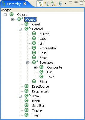
All the UI objects in the system are derived from the abstract classes Widget and Control (see Figure 4-4). This section and the ones immediately following it discuss the major widget types and their major APIs. API descriptions are taken from the Eclipse platform Javadoc.
Note
For every event, there is an add<EventName>Listener method and a corresponding remove<EventName>Listener method. Likewise, for every widget property, there is a get<PropertyName> and a set<PropertyName> method. In the interest of space, only the add<EventName>Listener and set<PropertyName> methods are listed. Each widget type has a constructor that requires the widget's parent as the first argument and the style (an int) as the second argument.
4.2.4.1. Widget
The Widget class is the abstract superclass of the following classes: Caret, Control (discussed below), DragSource, DropTarget, Item, Menu (discussed in Section 4.2.7), ScrollBar, and TRacker. Useful APIs include:
addDisposeListener(DisposeListener) Adds the listener to the collection of listeners that will be notified when the widget is disposed. addListener(int, Listener) Adds the listener to the collection of listeners that will be notified when an event of the given type occurs. dispose() Disposes of the OS resources associated with the receiver and all its descendents. getdata(String) Returns the application-defined property of the receiver with the specified name, or null if it has not been set. isDisposed() Returns TRue if the widget has been disposed and false otherwise. notifyListeners(int, Event) Notifies all the receiver's listeners for events of the given type that one such event has occurred by invoking the handleEvent() method. setData(String, Object) Sets the application-defined property of the receiver with the specified name to the given value. toString() Returns a string containing a concise, human-readable description of the widget.
4.2.4.2. Control
The Control class is the abstract superclass of all the dialog and window component classes such as Button, Label, ProgressBar, Sash, Scrollable, and Slider (each of these is described later in this chapter). Useful APIs include:
addControlListener(ControlListener) Adds the listener to the collection of listeners that will be notified when the control is moved or resized by sending it one of the messages defined in the ControlListener interface. addFocusListener(FocusListener) Adds the listener to the collection of listeners that will be notified when the control gains or loses focus by sending it one of the messages defined in the FocusListener interface. addHelpListener(HelpListener) Adds the listener to the collection of listeners that will be notified when help events are generated for the control by sending it one of the messages defined in the HelpListener interface. addKeyListener(KeyListener) Adds the listener to the collection of listeners that will be notified when keys are pressed and released on the system keyboard by sending it one of the messages defined in the KeyListener interface. addMouseListener(MouseListener) Adds the listener to the collection of listeners that will be notified when mouse buttons are pressed and released by sending it one of the messages defined in the MouseListener interface. addMouseMoveListener(MouseMoveListener) Adds the listener to the collection of listeners that will be notified when the mouse moves by sending it one of the messages defined in the MouseMoveListener interface. addMouseTrackListener(MouseTrackListener) Adds the listener to the collection of listeners that will be notified when the mouse passes or hovers over controls by sending it one of the messages defined in the MouseTrackListener interface. addPaintListener(PaintListener) Adds the listener to the collection of listeners that will be notified when the receiver needs to be painted by sending it one of the messages defined in the PaintListener interface. addTraverseListener(TraverseListener) Adds the listener to the collection of listeners that will be notified when traversal events occur by sending it one of the messages defined in the traverseListener interface. getdisplay() Returns the display on which the receiver was created. getParent() Returns the receiver's parent, which must be a Composite or null when the receiver is a shell that was created with null or a display for a parent. getShell() Returns the receiver's shell. isDisposed() Returns true if the widget has been disposed and false otherwise. isEnabled() Returns true if the receiver is enabled and all the receiver's ancestors are enabled and false otherwise. isVisible() Returns true if the receiver is visible and all the receiver's ancestors are visible and false otherwise. pack() Causes the receiver to be resized to its preferred size. redraw() Causes the entire bounds of the receiver to be marked as needing to be redrawn. setBackground(Color) Sets the receiver's background color to the color specified by the argument, or to the default system color for the control if the argument is null. setBounds(Rectangle) Sets the receiver's size and location to the rectangular area specified by the argument. setEnabled(boolean) Enables the receiver if the argument is TRue and disables it otherwise. boolean setFocus() Causes the receiver to have the keyboard focus such that all keyboard events will be delivered to it. setFont(Font) Sets the font that the receiver will use to paint textual information to the font specified by the argument, or to the default font for that kind of control if the argument is null. setForeground(Color) Sets the receiver's foreground color to the color specified by the argument, or to the default system color for the control if the argument is null. setLayoutData(Object) Sets the layout data associated with the receiver to the argument. setLocation(Point) Sets the receiver's location to the point specified by the argument that is relative to the receiver's parent (or its display if its parent is null). setRedraw(boolean) If the argument is false, causes subsequent drawing operations in the receiver to be ignored. setSize(Point) Sets the receiver's size to the point specified by the argument. setToolTipText(String) Sets the receiver's tool tip text to the argument, which may be null, indicating that no tool tip text should be shown. setVisible(boolean) Marks the receiver as visible if the argument is true, and marks it invisible otherwise. update() Forces all outstanding paint requests for the widget to be processed before this method returns.
4.2.4.3. Scrollable
The Scrollable class is the abstract superclass of all controls that can have scrollbars such as Composite, List, and Text. Useful APIs include:
getClientArea() Returns a rectangle describing the area of the receiver that is capable of displaying data (i.e., not covered by the "trimmings"). getHorizontalBar() Returns the receiver's horizontal scrollbar if it has one, and null if it does not. getVerticalBar() Returns the receiver's vertical scrollbar if it has one, and null if it does not.
4.2.5. Top-level classes
As stated earlier, each SWT application needs a display and one or more shells (representing each window frame).
4.2.5.1. Display
The display represents the link between the underlying platform, the UI thread, and SWT. Although the Display constructors are public, under normal circumstances, you should not be constructing new instances (unless you are creating a standalone SWT application); instead, the following two static Display methods return an instance.
getCurrent() Returns the display associated with the currently running thread or null if the currently running thread is not a UI thread for any display. getdefault() Returns the default display. This is the instance that was first created by the system.
Calls to SWT methods that create widgets or modify currently visible widgets must be made from the UI thread; otherwise, an SWTException is thrown indicating the call was made from a non-UI thread. A call to the previously listed getCurrent() method can be used to quickly determine whether or not the current thread is UI or non-UI. If the thread is non-UI, the following Display methods can be used to queue execution on the UI thread at the next available time.
asyncExec(Runnable) Causes the run() method of the runnable to be invoked by the UI thread at the next reasonable opportunity. syncExec(Runnable) Causes the run() method of the runnable to be invoked by the UI thread at the next reasonable opportunity. timerExec(int, Runnable) Causes the run() method of the runnable to be invoked by the UI thread after the specified number of milliseconds have elapsed.
These methods, combined with the methods listed previously, can be used to update visible widgets when responding to resource change events (see the end of Section 9.2, Processing Change Events, on page 379), displaying error messages (see Section 20.4.3, OpenEmailAction, on page 720), or simply deferring execution until the widgets have been initialized (see Section 8.2.5, Label provider, on page 342).
In addition to managing the UI event loop, it also provides access to platform resources that SWT needs. Useful APIs include:
addListener(int, Listener) Adds the listener to the collection of listeners that will be notified when an event of the given type occurs. beep() Causes the system hardware to emit a short sound (if it supports this capability). close() Requests that the connection between SWT and the underlying OS be closed. disposeExec(Runnable) Causes the run() method of the runnable to be invoked by the UI thread just before the display is disposed. findWidget(int) Given the OS handle for a widget, returns the instance of the Widget subclass, which represents it in the currently running application if such an instance exists, or null if no matching widget can be found. getActiveShell() Returns the currently active Shell, or null if no shell belonging to the currently running application is active. getBounds() Returns a rectangle describing the receiver's size and location. getClientArea() Returns a rectangle describing the area of the receiver that is capable of displaying data. getCursorControl() Returns the control that the onscreen pointer is currently over, or null if it is not currently over one of the controls built by the currently running application. getCursorLocation() Returns the location of the onscreen pointer relative to the top left corner of the screen. getdata(String) Returns the application-defined property of the receiver with the specified name, or null if it has not been set. getdoubleClickTime() Returns the longest duration, in milliseconds, between two mouse button clicks that will be considered a double-click by the underlying OS. getFocusControl() Returns the control that currently has keyboard focus, or null if keyboard events are not currently going to any of the controls built by the currently running application. getShells() Returns an array containing all shells that have not been disposed and have the receiver as their display. getSystemColor(int) Returns the matching standard color for the given constant, which should be one of the color constants specified in the class SWT. getSystemFont() Returns a reasonable font for applications to use. readAndDispatch() Reads an event from the OS's event queue, dispatches it appropriately, and returns true if there is potentially more work to do, or false if the caller can sleep until another event is placed on the event queue. setCursorLocation(Point) Sets the location of the onscreen pointer relative to the top left corner of the screen. setData(String, Object) Sets the application-defined property of the receiver with the specified name to the given argument. sleep() Causes the UI thread to sleep (i.e., to be put in a state where it does not consume central processing unit [CPU] cycles) until an event is received or it is otherwise awakened. update() Forces all outstanding paint requests for the display to be processed before this method returns.
4.2.5.2. Shell
Every window has a shell representing the window frame with which the user interacts. The shell handles the familiar moving and sizing behavior common to all windows and acts as the parent for widgets displayed within its bounds (see Section 11.1.10, Opening a dialogfinding a parent shell, on page 428). Useful APIs include:
addShellListener(ShellListener) Adds the listener to the collection of listeners that will be notified when operations are performed on the receiver by sending the listener one of the messages defined in the ShellListener interface. close() Requests that the window manager close the receiver in the same way it would be closed if the user clicked on the "close box" or performed some other platform-specific key or mouse combination that indicated the window should be removed. dispose() Disposes of the OS resources associated with the receiver and all its descendents. getdisplay() Returns the display on which the receiver was created. getShell() Returns the receiver's shell. getShells() Returns an array containing all shells that are descendents of the receiver. isEnabled() Returns true if the receiver is enabled and all the receiver's ancestors are enabled and false otherwise. open() Moves the receiver to the top of the drawing order for the display on which it was created (so that all other shells on that display, which are not the receiver's children, will be drawn behind it), marks it visible, sets focus to its default button (if it has one), and asks the window manager to make the shell active. setActive() Moves the receiver to the top of the drawing order for the display on which it was created (so that all other shells on that display, which are not the receiver's children, will be drawn behind it) and asks the window manager to make the shell active. setEnabled(boolean enabled) Enables the receiver if the argument is true and disables it otherwise. setVisible(boolean visible) Marks the receiver as visible if the argument is true and marks it invisible otherwise.
4.2.6. Useful widgets
Dozens of widgets are defined within the SWT class hierarchy. This section discusses the widgets most commonly used in plug-in development, such as labels, buttons, text fields, lists, tables, trees, containers, and tab folders. It also provides a list of useful APIs and creation styles for each widget.
4.2.6.1. Label
Labels are static controls that display either strings or images as their contents. They do not generate any special events and do not support any user interaction. Useful APIs include:
setAlignment(int) Controls how text and images will be displayed in the receiver. Valid arguments include SWT.LEFT, SWT.RIGHT, and SWT.CENTER. setImage(Image) Sets the receiver's image to the argument, which may be null, indicating that no image should be displayed. setText(String) Sets the receiver's text.
Useful creation styles include:
SWT.SHADOW_IN Creates an inset shadow around the widget. SWT.SHADOW_OUT Creates an outset shadow around the widget. SWT.SHADOW_NONE Creates a widget with no shadow. SWT.WRAP Causes the text of the widget to wrap onto multiple lines, if necessary. SWT.SEPARATOR Creates a single vertical or horizontal line. SWT.HORIZONTAL Creates a horizontal line. SWT.VERTICAL Creates a vertical line. SWT.LEFT Left-justifies the widget within its bounding box. SWT.RIGHT Right-justifies the widget within its bounding box. SWT.CENTER Centers the widget within its bounding box.
4.2.6.2. Button
Buttons provide a mechanism to initiate an action when clicked. They generate a Selection event when pressed and released. Buttons can display either strings or images as their contents. Depending on their style settings, buttons can represent a number of common UI element types such as pushbuttons, checkboxes, radio buttons, toggle buttons, and arrow buttons. Useful APIs include:
addSelectionListener(SelectionListener) Adds the listener to the collection of listeners that will be notified when the control is selected by sending it one of the messages defined in the SelectionListener interface. getSelection() Returns TRue if the receiver is selected and false otherwise. setAlignment(int) Controls how text, images, and arrows will be displayed in the receiver. setImage(Image) Sets the receiver's image to the argument, which may be null, indicating that no image should be displayed. setSelection(boolean) Sets the selection state of the receiver if it is of type SWT.CHECK, SWT.RADIO, or SWT.TOGGLE. setText(String) Sets the receiver's text.
Useful creation styles include:
SWT.ARROW Creates an arrow button widget. SWT.CHECK Creates a checkbox widget. SWT.PUSH Creates a pushbutton widget. SWT.RADIO Creates a radio button widget. SWT.TOGGLE Creates a toggle button widget. SWT.UP Creates an upward-pointing arrow button. SWT.DOWN Creates a downward-pointing arrow button. SWT.LEFT Creates a leftward-pointing arrow button or left-justifies the widget within its bounding box. SWT.RIGHT Creates a rightward-pointing arrow button or right-justifies the widget within its bounding box. SWT.CENTER Centers the widget within its bounding box.
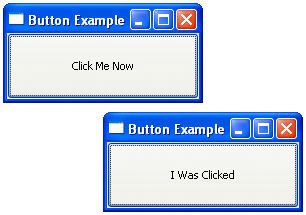
The example code that follows (shown without a package statement) creates a window with a single pushbutton. Clicking on the pushbutton will change the text of the button (see Figure 4-5).
import org.eclipse.swt.*;

import org.eclipse.swt.events.*;

import org.eclipse.swt.layout.*;

import org.eclipse.swt.widgets.*;

public class ButtonExample {
   public static void main(String[] args) {
      Display display = new Display();
      Shell shell = new Shell(display);
      shell.setText("Button Example");
      shell.setBounds(100, 100, 200, 100);
      shell.setLayout(new FillLayout());
      final Button button = new Button(shell, SWT.PUSH);
      button.setText("Click Me Now");
      button.addSelectionListener(new SelectionAdapter() {
         public void widgetSelected(SelectionEvent event) {
           button.setText("I Was Clicked");
         }
      });
      shell.open();
      while (!shell.isDisposed()) {
         if (!display.readAndDispatch()) display.sleep();
      }
      display.dispose();
   }
}
Relative to the first example in this chapter, the interesting lines in the preceding example are highlighted in bold. After the creation of the button, a selection listener is added in which a SelectionAdapter is created that overrides the widgetSelected() method.
4.2.6.3. Text
Text widgets provide text viewing and editing capabilities. If the user enters more text than can be accommodated within the widget, it will automatically scroll. Useful APIs include:
addModifyListener(ModifyListener) Adds the listener to the collection of listeners that will be notified when the receiver's text is modified by sending it one of the messages defined in the ModifyListener interface. addSelectionListener(SelectionListener) Adds the listener to the collection of listeners that will be notified when the control is selected by sending it one of the messages defined in the SelectionListener interface. addVerifyListener(VerifyListener) Adds the listener to the collection of listeners that will be notified when the receiver's text is verified by sending it one of the messages defined in the VerifyListener interface. clearSelection() Clears the selection. copy() Copies the selected text. cut() Cuts the selected text. getSelectionText() Gets the selected text. getText() Gets the widget text. getText(int start, int end) Gets a range of text. insert(String) Inserts a string. paste() Pastes text from the clipboard. selectAll() Selects all the text in the receiver. setEchoChar(char echo) Sets the echo character. setEditable(boolean editable) Sets the editable state. setSelection(int start, int end) Sets the selection. setText(String) Sets the contents of the receiver to the given string. setTextLimit(int) Sets the maximum number of characters that the receiver is capable of holding to be the argument. setTopIndex(int) Sets the zero-relative index of the line that is currently at the top of the receiver.
Useful creation styles include:
SWT.SINGLE Creates a single-line text widget. SWT.MULTI Creates a multi-line text widget. SWT.WRAP Causes widget's text to wrap onto multiple lines if necessary. SWT.READ_ONLY Creates a read-only text widget that cannot be edited. SWT.LEFT Creates a left-justified text widget. SWT.RIGHT Creates a right-justified text widget. SWT.CENTER Creates a center-justified text widget.
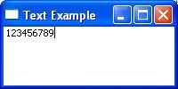
The example code that follows creates a window frame with a single-line text field, which only allows digits (09) to be entered (see Figure 4-6).
import org.eclipse.swt.*;
import org.eclipse.swt.events.*;
import org.eclipse.swt.layout.*;
import org.eclipse.swt.widgets.*;

public class TextExample {
   public static void main(String[] args) {
      Display display = new Display();
      Shell shell = new Shell(display);
      shell.setText("Text Example");
      shell.setBounds(100, 100, 200, 100);
      shell.setLayout(new FillLayout());
      final Text text = new Text(shell, SWT.MULTI);
      text.addVerifyListener(new VerifyListener() {
         public void verifyText(VerifyEvent event) {
            event.doit = event.text.length() == 0
               || Character.isDigit(event.text.charAt(0));
         }
      });
      shell.open();
      while (!shell.isDisposed()) {
         if (!display.readAndDispatch()) display.sleep();
      }
      display.dispose();
   }
}
As in the previous example, interesting lines are highlighted in bold. After the creation of the text widget, a verify listener is added in which a VerifyListener is created that overrides the verifyText() method to verify that the character entered is a digit. Note: If the user deletes or backspaces over some text, the event.text will be empty.
4.2.6.4. List
List widgets present a list of items and allow the user to select one or more of them. Lists generate a Selection event when an item is selected. Useful APIs include:
add(String) Adds the argument to the end of the receiver's list. addSelectionListener(SelectionListener) Adds the listener to the collection of listeners that will be notified when the receiver's selection changes by sending it one of the messages defined in the SelectionListener interface. deselect(int) Deselects the item at the given zero-relative index in the receiver. deselectAll() Deselects all selected items in the receiver. getItem(int) Returns the item at the given, zero-relative index in the receiver. getItemCount() Returns the number of items contained in the receiver. getItems() Returns an array of strings that are items in the receiver. getSelection() Returns an array of strings that are currently selected in the receiver. getSelectionCount() Returns the number of selected items contained in the receiver. getSelectionIndex() Returns the zero-relative index of the item that is currently selected in the receiver, or -1 if no item is selected. getSelectionIndices() Returns the zero-relative indices of the items that are currently selected in the receiver. indexOf(String) Gets the index of an item. remove(int) Removes the item from the receiver at the given zero-relative index. remove(String) Searches the receiver's list starting at the first item until an item is found that is equal to the argument and removes that item from the list. removeAll() Removes all the items from the receiver. select(int) Selects the item at the given zero-relative index in the receiver's list. selectAll() Selects all the items in the receiver. setItems(String[] items) Sets the receiver's items to be the given array of items. setSelection(int) Selects the item at the given zero-relative index in the receiver. setSelection(String[]) Sets the receiver's selection to be the given array of items. setTopIndex(int) Sets the zero-relative index of the line that is currently at the top of the receiver.
Useful creation styles include:
SWT.SINGLE Creates a single-selection list widget. SWT.MULTI Creates a multiple-selection list widget.
The following example creates a window frame with a single-selection list box. Clicking or double-clicking on an item will print the selection to the console (see Figure 4-7).
import org.eclipse.swt.*;
import org.eclipse.swt.events.*;
import org.eclipse.swt.layout.*;
import org.eclipse.swt.widgets.*;

public class ListExample {
   public static void main(String[] args) {
      Display display = new Display();
      Shell shell = new Shell(display);
      shell.setText("List Example");
      shell.setBounds(100, 100, 200, 100);
      shell.setLayout(new FillLayout());
      final List list = new List(shell, SWT.SINGLE);
      list.setItems(new String[]
         {"First", "Second", "Third"});
      list.addSelectionListener(new SelectionAdapter() {
         public void widgetSelected(SelectionEvent event) {
            String[] selected = list.getSelection();
            if (selected.length > 0)
               System.out.println(
                  "Selected: " + selected[0]);
         }
         public void widgetDefaultSelected(
            SelectionEvent event) {
            String[] selected = list.getSelection();
            if (selected.length > 0)
               System.out.println(
                  "Default Selected: " + selected[0]);
         }
      });
      shell.open();
      while (!shell.isDisposed()) {
         if (!display.readAndDispatch()) display.sleep();
      }
      display.dispose();
   }
}
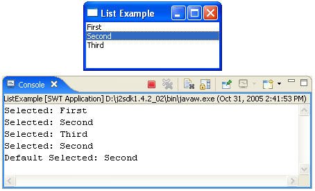
After the list widget is created, its contents are set using the setItems() method. Next, a selection listener is added in which a SelectionAdapter is created that overrides the widgetSelected() and widgetDefaultSelected() methods to print any items selected or double-clicked.
4.2.6.5. Combo
Similar to the list widget, the combo box widget allows the user to select a single item from a list of available items. Depending on how a combo is configured, it may also allow the user to enter a new value into the text field. The last selected or entered item is displayed in the text box. Useful APIs include:
add(String) Adds the argument to the end of the receiver's list. addModifyListener(ModifyListener) Adds the listener to the collection of listeners that will be notified when the receiver's text is modified by sending it one of the messages defined in the ModifyListener interface. addSelectionListener(SelectionListener) Adds the listener to the collection of listeners that will be notified when the receiver's selection changes by sending it one of the messages defined in the SelectionListener interface. clearSelection() Sets the selection in the receiver's text field to an empty selection starting just before the first character. copy() Copies the selected text. cut() Cuts the selected text. deselect(int) Deselects the item at the given zero-relative index in the receiver's list. deselectAll() Deselects all selected items in the receiver's list. getItem(int) Returns the item at the given, zero-relative index in the receiver's list. getItemCount() Returns the number of items contained in the receiver's list. getItems() Returns an array of strings that are items in the receiver's list. getSelectionIndex() Returns the zero-relative index of the item that is currently selected in the receiver's list, or -1 if no item is selected. getText() Returns a string containing a copy of the contents of the receiver's text field. indexOf(String) Searches the receiver's list starting at the first item (index 0) until an item is found that is equal to the argument and returns the index of that item. paste() Pastes text from the clipboard. remove(int) Removes the item from the receiver's list at the given zero-relative index. remove(String) Searches the receiver's list starting at the first item until an item is found that is equal to the argument and removes that item from the list. removeAll() Removes all the items from the receiver's list. select(int) Selects the item at the given zero-relative index in the receiver's list. setItems(String[] items) Sets the receiver's list to be the given array of items. setText(String) Sets the contents of the receiver's text field to the given string. setTextLimit(int) Sets the maximum number of characters that the receiver's text field is capable of holding to be the argument.
Useful creation styles include:
SWT.DROP_DOWN Creates a drop-down list widget. Editable drop-down list widgets are also known as combo boxes. SWT.READ_ONLY Creates a read-only drop-down list widget. SWT.SIMPLE Creates a combo widget in which the list is always present.
The following example creates a window frame with two combo widgets and a label widget. Selecting an item from the first or second combo box or entering a new value into the second combo box will change the label's contents to reflect the selection (see Figure 4-8).
import org.eclipse.swt.*;
import org.eclipse.swt.events.*;
import org.eclipse.swt.layout.*;
import org.eclipse.swt.widgets.*;

public class ComboExample {
   public static void main(String[] args) {
      Display display = new Display();
      Shell shell = new Shell(display);
      shell.setText("Combo Example");
      shell.setBounds(100, 100, 200, 100);
      shell.setLayout(new FillLayout(SWT.VERTICAL));
      final Combo combo1 = new Combo(shell,SWT.READ_ONLY);
      final Combo combo2 = new Combo(shell,SWT.DROP_DOWN);
      final Label label = new Label(shell, SWT.CENTER);
      combo1.setItems(new String[]
         {"First", "Second", "Third"});
      combo1.setText("First");
      combo1.addSelectionListener(new SelectionAdapter() {
         public void widgetSelected(SelectionEvent event) {
            label.setText("Selected: " + combo1.getText());
          }
      });
      combo2.setItems(new String[]
         {"First", "Second", "Third"});
      combo2.setText("First");
      combo2.addModifyListener(new ModifyListener() {
         public void modifyText(ModifyEvent event) {
             label.setText("Entered: " + combo2.getText());
          }
       });
      shell.open();
       while (!shell.isDisposed()) {
         if (!display.readAndDispatch()) display.sleep();
      }
      display.dispose();
   }
}
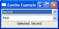
After the creation of the combo widgets and the label widget, the contents of the combo widgets are set using the setItems() method and their initial selections (the contents of their text fields) with the setText() method. A selection listener is added to the first combo in which a SelectionAdapter is created that overrides the widgetSelected() method, and a modify listener is added to the second combo in which a ModifyListener is created that overrides the modifyText() method. Both methods update the contents of the label widget when their respective combo changes its selection.
4.2.6.6. Table
The table widget provides a vertical, multicolumn list of items showing a row of cells for each item in the list. The columns of the table are defined by one or more TableColumn instances, each of which defines its own heading, width, and alignment. Useful APIs include:
addSelectionListener(SelectionListener) Adds the listener to the collection of listeners that will be notified when the receiver's selection changes by sending it one of the messages defined in the SelectionListener interface. deselect(int) Deselects the item at the given zero-relative index in the receiver. deselectAll() Deselects all selected items in the receiver. getColumn(int) Returns the column at the given, zero-relative index in the receiver. getColumns() Returns an array of TableColumns that are columns in the receiver. getItem(int) Returns the item at the given, zero-relative index in the receiver. getSelection() Returns an array of TableItems that are currently selected in the receiver. getSelectionCount() Returns the number of selected items contained in the receiver. getSelectionIndex() Returns the zero-relative index of the item that is currently selected in the receiver, or -1 if no item is selected. getSelectionIndices() Returns the zero-relative indices of the items that are currently selected in the receiver. indexOf(TableColumn) Searches the receiver's list starting at the first column (index 0) until a column is found that is equal to the argument and returns the index of that column. indexOf(TableItem) Searches the receiver's list starting at the first item (index 0) until an item is found that is equal to the argument and returns the index of that item. remove(int) Removes the item from the receiver at the given zero-relative index. removeAll() Removes all the items from the receiver. select(int) Selects the item at the given zero-relative index in the receiver. selectAll() Selects all the items in the receiver. setHeaderVisible(boolean) Marks the receiver's header as visible if the argument is TRue, and marks it invisible otherwise. setLinesVisible(boolean) Marks the receiver's lines as visible if the argument is true, and marks it invisible otherwise. setSelection(int) Selects the item at the given zero-relative index in the receiver. setSelection(TableItem[]) Sets the receiver's selection to be the given array of items. setTopIndex(int) Sets the zero-relative index of the item that is currently at the top of the receiver.
Useful creation styles include:
SWT.SINGLE Creates a single-selection table widget. SWT.MULTI Creates a multiple-selection table widget. SWT.CHECK Creates a checkbox table widget. SWT.FULL_SELECTION Creates a table widget with row selection (rather than cell selection).
Useful TableColumn APIs include:
addControlListener(ControlListener) Adds the listener to the collection of listeners that will be notified when the control is moved or resized by sending it one of the messages defined in the ControlListener interface. addSelectionListener(SelectionListener) Adds the listener to the collection of listeners that will be notified when the control is selected by sending it one of the messages defined in the SelectionListener interface. pack() Causes the receiver to be resized to its preferred size. setAlignment(int) Controls how text and images will be displayed in the receiver. setImage(Image) Sets the receiver's image to the argument, which may be null, indicating that no image should be displayed. setResizable(boolean) Sets the resizable attribute. setText(String) Sets the receiver's text. setWidth(int) Sets the width of the receiver.
Useful TableItem APIs include:
getChecked() Returns true if the receiver is checked and false otherwise. getText(int) Returns the text stored at the given column index in the receiver, or empty string if the text has not been set. setBackground(Color) Sets the receiver's background color to the color specified by the argument, or to the default system color for the item if the argument is null. setChecked(boolean) Sets the checked state of the checkbox for this item. setForeground(Color) Sets the receiver's foreground color to the color specified by the argument, or to the default system color for the item if the argument is null. setGrayed(boolean) Sets the grayed state of the checkbox for this item. setImage(Image) Sets the receiver's image to the argument, which may be null, indicating that no image should be displayed. setImage(Image[]) Sets the image for multiple columns in the table. setImage(int, Image) Sets the receiver's image at a column. setImageIndent(int) Sets the image indent. setText(int, String) Sets the receiver's text at a column. setText(String) Sets the receiver's text. setText(String[]) Sets the text for multiple columns in the table.
The following example creates a two-column, two-item table. Clicking on an item causes the cell's contents to print to the console (see Figure 4-9).
import org.eclipse.swt.*;
import org.eclipse.swt.events.*;
import org.eclipse.swt.layout.*;
import org.eclipse.swt.widgets.*;

public class TableExample {
   public static void main(String[] args) {
      Display display = new Display();
      Shell shell = new Shell(display);
      shell.setText("Table Example");
      shell.setBounds(100, 100, 200, 100);
      shell.setLayout(new FillLayout());
      final Table table = new Table(shell,
         SWT.SINGLE | SWT.BORDER | SWT.FULL_SELECTION);
      table.setHeaderVisible(true);
      table.setLinesVisible(true);
      TableColumn column1 =
         new TableColumn(table, SWT.NULL);
      column1.setText("Name");
      column1.pack();
      TableColumn column2 =
         new TableColumn(table, SWT.NULL);
      column2.setText("Age");
      column2.pack();
      TableItem item1 = new TableItem(table, SWT.NULL);
      item1.setText(new String[] {"Dan", "41"});
      TableItem item2 = new TableItem(table, SWT.NULL);
      item2.setText(new String[] {"Eric", "42"});
      table.addSelectionListener(new SelectionAdapter() {
         public void widgetSelected(SelectionEvent event) {
            TableItem[] selected = table.getSelection();
            if (selected.length > 0) {
               System.out.println("Name: " +
                  selected[0].getText(0));
               System.out.println("Age: " +
                  selected[0].getText(1));
            }
         }
      });
      shell.open();
      while (!shell.isDisposed()) {
         if (!display.readAndDispatch()) display.sleep();
      }
      display.dispose();
   }
}
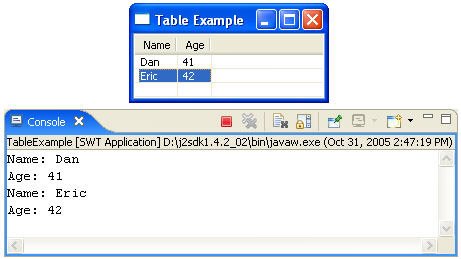
The table widget is created with full selection behavior. Its headers are made visible with the setHeaderVisble() method and its lines are made visible with the setLinesVisible() method. Next, each column is created and its column header is set with the setText() method. The pack() method sets the size of each column to the maximum size of its contents. Each table row item is created next and cell contents are set with the setText() method (which expects an array of strings, one for each column). Finally, a selection listener is added to the table in which a SelectionAdapter is created that overrides the widgetSelected() method to print any items that are selected.
4.2.6.7. Tree
The tree widget is useful for displaying information in a hierarchical manner. A tree consists of a list of items composed of other items, which in turn can be composed of other items, and so on. A user navigates through a tree by expanding and collapsing items to view and hide their component items. Useful APIs include:
addSelectionListener(SelectionListener) Adds the listener to the collection of listeners that will be notified when the receiver's selection changes by sending it one of the messages defined in the SelectionListener interface. addTreeListener(TreeListener) Adds the listener to the collection of listeners that will be notified when an item in the receiver is expanded or collapsed by sending it one of the messages defined in the treeListener interface. deselectAll() Deselects all selected items in the receiver. getItemCount() Returns the number of items contained in the receiver that are direct item children of the receiver. getItems() Returns the items contained in the receiver that are direct item children of the receiver. getSelection() Returns an array of TReeItems that are currently selected in the receiver. getSelectionCount() Returns the number of selected items contained in the receiver. removeAll() Removes all the items from the receiver. selectAll() Selects all the items in the receiver. setSelection(TreeItem[]) Sets the receiver's selection to be the given array of items. setTopItem(TreeItem) Sets the item that is currently at the top of the receiver.
Useful creation styles include:
SWT.SINGLE Creates a single-selection tree widget. SWT.MULTI Creates a multiple-selection tree widget. SWT.CHECK Creates a checkbox tree widget.
Useful treeItem APIs include:
getChecked() Returns true if the receiver is checked and false otherwise. getExpanded() Returns true if the receiver is expanded and false otherwise. getItemCount() Returns the number of items contained in the receiver that are direct item children of the receiver. getItems() Returns an array of treeItems that are the direct item children of the receiver. getParent() Returns the receiver's parent, which must be a tree. getParentItem() Returns the receiver's parent item, which must be a TReeItem or null when the receiver is a root. setBackground(Color) Sets the receiver's background color to the color specified by the argument, or to the default system color for the item if the argument is null. setChecked(boolean) Sets the checked state of the receiver. setExpanded(boolean) Sets the expanded state of the receiver. setForeground(Color) Sets the receiver's foreground color to the color specified by the argument, or to the default system color for the item if the argument is null. setGrayed(boolean grayed) Sets the grayed state of the receiver. setImage(Image) Sets the receiver's image to the argument, which may be null, indicating that no image should be displayed. setText(String) Sets the receiver's text.
The following example creates a tree with three levels of items (see Figure 4-10). Clicking on an item causes its name to print to the console.
import org.eclipse.swt.*;
import org.eclipse.swt.events.*;
import org.eclipse.swt.layout.*;
import org.eclipse.swt.widgets.*;

public class TreeExample {
   public static void main(String[] args) {
      Display display = new Display();
      Shell shell = new Shell(display);
      shell.setText("Tree Example");
      shell.setBounds(100, 100, 200, 200);
      shell.setLayout(new FillLayout());
      final Tree tree = new Tree(shell, SWT.SINGLE);
      for (int i = 1; i < 4; i++) {
         TreeItem grandParent = new TreeItem(tree, 0);
         grandParent.setText("Grand Parent - " + i);
         for (int j = 1; j < 4; j++) {
            TreeItem parent = new TreeItem(grandParent,0);
            parent.setText("Parent - " + j);
            for (int k = 1; k < 4; k++) {
               TreeItem child = new TreeItem(parent, 0);
               child.setText("Child - " + k);
            }
         }
      }
      tree.addSelectionListener(new SelectionAdapter() {
         public void widgetSelected(SelectionEvent event) {
            TreeItem[] selected = tree.getSelection();
            if (selected.length > 0) {
               System.out.println("Selected: " +
                  selected[0].getText());
            }
         }
      });
      shell.open();
      while (!shell.isDisposed()) {
         if (!display.readAndDispatch()) display.sleep();
      }
      display.dispose();
   }
}
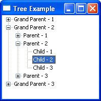
After the creation of the tree widget, new items are created and their labels are set with the setText() method. Many of the items have child items of their own. Finally, a selection listener is added in which a SelectionAdapter is created that overrides the widgetSelected() method to print a selected item.
4.2.6.8. Composite
The composite widget is used as a container for other widgets. The widget's children are widgets contained within the bounds of the composite and resize themselves relative to it. Useful APIs include:
getChildren() Returns an array containing the receiver's children. layout() If the receiver has a layout, it asks the layout to set the size and location of the receiver's children. setLayout(Layout) Sets the layout that is associated with the receiver to be the argument, which may be null. setTabList(Control[]) Sets the tabbing order for the specified controls to match the order in which they occur in the argument list.
Useful creation styles include:
SWT.BORDER Creates a composite widget with a border. SWT.NO_RADIO_GROUP Prevents child radio button behavior. SWT.H_SCROLL Creates a composite widget with a horizontal scrollbar. SWT.V_SCROLL Creates a composite widget with a vertical scrollbar.
The following example expands on the earlier button example by inserting a composite widget between the shell and the button (see Figure 4-11).
import org.eclipse.swt.*;
import org.eclipse.swt.events.*;
import org.eclipse.swt.widgets.*;

public class CompositeExample {
   public static void main(String[] args) {
      Display display = new Display();
      Shell shell = new Shell(display);
      shell.setText("Composite Example");
      shell.setBounds(100, 100, 200, 200);
      Composite composite = new Composite(
         shell,SWT.BORDER);
      composite.setBounds(25, 25, 150, 125);
      final Button button = new Button(composite,SWT.PUSH);
      button.setBounds(25, 25, 100, 75);
      button.setText("Click Me Now");
      button.addSelectionListener(new SelectionAdapter() {
         public void widgetSelected(SelectionEvent event) {
            button.setText("I Was Clicked");
         }
      });
      shell.open();
      while (!shell.isDisposed()) {
         if (!display.readAndDispatch()) display.sleep();
      }
      display.dispose();
   }
}
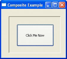
A composite widget is created as a child of the shell, and then the composite acts as the parent of the button widget. Note that the button is positioned relative to the composite, not the shell.
4.2.6.9. Group
Group widgets are a special type of composite widget that surround children with an etched border and an optional label. Each child widget is contained within the bounds of the group and resizes itself relative to it. Useful APIs include:
getChildren() Returns an array containing the receiver's children. layout() If the receiver has a layout, it asks the layout to set the size and location of the receiver's children. setLayout(Layout) Sets the layout that is associated with the receiver to be the argument, which may be null. setTabList(Control[]) Sets the tabbing order for the specified controls to match the order in which they occur in the argument list. setText(String) Sets the receiver's text, which is the string that will be displayed as the receiver's title, to the argument, which may not be null.
Useful creation styles include:
SWT.BORDER Creates a composite widget with a border. SWT.NO_RADIO_GROUP Prevents child radio button behavior.
The example code that follows replaces the composite in the previous example with a group widget (see Figure 4-12).
import org.eclipse.swt.*;
import org.eclipse.swt.events.*;
import org.eclipse.swt.widgets.*;

public class GroupExample {
   public static void main(String[] args) {
      Display display = new Display();
      Shell shell = new Shell(display);
      shell.setText("Group Example");
      shell.setBounds(100, 100, 200, 200);
      Group group = new Group(shell, SWT.NULL);
      group.setText("My Group");
      group.setBounds(25, 25, 150, 125);
      final Button button = new Button(group, SWT.PUSH);
      button.setBounds(25, 25, 100, 75);
      button.setText("Click Me Now");
      button.addSelectionListener(new SelectionAdapter() {
         public void widgetSelected(SelectionEvent event) {
            button.setText("I Was Clicked");
         }
      });
      shell.open();
      while (!shell.isDisposed()) {
         if (!display.readAndDispatch()) display.sleep();
      }
      display.dispose();
   }
}
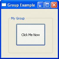
A group widget is created as a child of the shell and acts as the parent of the button widget. In addition to the border, which is always present, the group widget also has a label.
4.2.6.10. Tab folder
The tab folder widget is used to organize information within a window frame into multiple pages that appear as a set of notebook tabs. Clicking on a tab brings that page to the front. Tabs can be labels with images and text. Useful APIs include:
addSelectionListener(SelectionListener) Adds the listener to the collection of listeners that will be notified when the receiver's selection changes by sending it one of the messages defined in the SelectionListener interface. TabItem getItem(int) Returns the item at the given, zero-relative index in the receiver. getItemCount() Returns the number of items contained in the receiver. getItems() Returns an array of TabItems that are items in the receiver. getSelection() Returns an array of TabItems that are currently selected in the receiver. getSelectionIndex() Returns the zero-relative index of the item that is currently selected in the receiver, or -1 if no item is selected. indexOf(TabItem item) Searches the receiver's list starting at the first item (index 0) until an item is found that is equal to the argument, and returns the index of that item. setSelection(int) Selects the item at the given zero-relative index in the receiver.
Useful tab folder APIs include:
getControl() Returns the control that is used to fill the client area of the tab folder when the user selects the tab item. setControl(Control control) Sets the control that is used to fill the client area of the tab folder when the user selects a tab item. setImage(Image) Sets the receiver's image to the argument, which may be null, indicating that no image should be displayed. setText(String) Sets the receiver's text. setToolTipText(String) Sets the receiver's tool tip text to the argument, which may be null, indicating that no tool tip text should be shown.
The example code that follows creates a tab folder with several tabs. Each tab contains a composite containing a single button (see Figure 4-13).
import org.eclipse.swt.*;
import org.eclipse.swt.events.*;
import org.eclipse.swt.layout.*;
import org.eclipse.swt.widgets.*;

public class TabFolderExample {
   public static void main(String[] args) {
      Display display = new Display();
      Shell shell = new Shell(display);
      shell.setText("TabFolder Example");
      shell.setBounds(100, 100, 175, 125);
      shell.setLayout(new FillLayout());
      final TabFolder tabFolder =
         new TabFolder(shell, SWT.BORDER);
      for (int i = 1; i < 4; i++) {
         TabItem tabItem =
            new TabItem(tabFolder, SWT.NULL);
         tabItem.setText("Tab " + i);
         Composite composite =
            new Composite(tabFolder, SWT.NULL);
         tabItem.setControl(composite);
         Button button = new Button(composite, SWT.PUSH);
         button.setBounds(25, 25, 100, 25);
         button.setText("Click Me Now");
         button.addSelectionListener(
            new SelectionAdapter(){
            public void widgetSelected(
               SelectionEvent event) {
               ((Button)event.widget)
                  .setText("I Was Clicked");
            }
         });
      }
      shell.open();
      while (!shell.isDisposed()) {
         if (!display.readAndDispatch()) display.sleep();
      }
      display.dispose();
   }
}
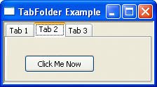
After the tab folder is created, several tab items are added. For each tab item, the setControl() method is used to fill its client area with a composite widget. A button widget is then added to each composite.
4.2.7. Menus
Menus provide an easy way for the user to trigger a variety of commands and actions. Top-level menus contain any number of menu item children. Useful menu APIs include the following:
addHelpListener(HelpListener) Adds the listener to the collection of listeners that will be notified when help events are generated for the control by sending it one of the messages defined in the HelpListener interface. addMenuListener(MenuListener) Adds the listener to the collection of listeners that will be notified when menus are hidden or shown by sending it one of the messages defined in the MenuListener interface. getItem(int) Returns the item at the given, zero-relative index in the receiver. getItemCount() Returns the number of items contained in the receiver. getItems() Returns an array of menu items that are the items in the receiver. getParentItem() Returns the receiver's parent item, which must be a menu item or null when the receiver is a root. getParentMenu() Returns the receiver's parent item, which must be a menu or null when the receiver is a root. indexOf(MenuItem item) Searches the receiver's list starting at the first item (index 0) until an item is found that is equal to the argument and returns the index of that item. setEnabled(boolean enabled) Enables the receiver if the argument is true and disables it otherwise. setVisible(boolean visible) Marks the receiver as visible if the argument is true and marks it invisible otherwise.
Useful menu creation styles include:
SWT.BAR Creates a menu bar. SWT.DROP_DOWN Creates a drop-down menu. SWT.POP_UP Creates a popup menu.
Useful menu item APIs include:
addArmListener(ArmListener) Adds the listener to the collection of listeners that will be notified when the Arm events are generated for the control by sending it one of the messages defined in the ArmListener interface. addHelpListener(HelpListener) Adds the listener to the collection of listeners that will be notified when the help events are generated for the control by sending it one of the messages defined in the HelpListener interface. addSelectionListener(SelectionListener) Adds the listener to the collection of listeners that will be notified when the control is selected by sending it one of the messages defined in the SelectionListener interface. getParent() Returns the receiver's parent, which must be a menu. getSelection() Returns true if the receiver is selected and false otherwise. isEnabled() Returns true if the receiver is enabled and all the receiver's ancestors are enabled and false otherwise. setAccelerator(int accelerator) Sets the widget accelerator. setEnabled(boolean enabled) Enables the receiver if the argument is true and disables it otherwise. setImage(Image) Sets the image the receiver will display to the argument. setMenu(Menu) Sets the receiver's pull-down menu to the argument. setSelection(boolean) Sets the selection state of the receiver. setText(String) Sets the receiver's text.
Useful menu item creation styles include:
SWT.CHECK Creates a check menu that toggles on and off. SWT.CASCADE Creates a cascade menu with a submenu. SWT.PUSH Creates a standard menu item. SWT.RADIO Creates a radio button menu. SWT.SEPARATOR Creates a menu item separator.
The following example creates a menu bar with a single menu containing two menu items and a separator (see Figure 4-14).
import org.eclipse.swt.*;
import org.eclipse.swt.events.*;
import org.eclipse.swt.widgets.*;

public class MenuExample {
   public static void main(String[] args) {
      Display display = new Display();
      final Shell shell = new Shell(display);
      shell.setText("Menu Example");
      shell.setBounds(100, 100, 200, 100);
      Menu bar = new Menu(shell, SWT.BAR);
      shell.setMenuBar(bar);
      MenuItem fileMenu = new MenuItem(bar, SWT.CASCADE);
      fileMenu.setText("&File");
      Menu subMenu = new Menu(shell, SWT.DROP_DOWN);
      fileMenu.setMenu(subMenu);
      MenuItem selectItem = new MenuItem(
         subMenu, SWT.NULL);
      selectItem.setText("&Select Me Now\tCtrl+S");
      selectItem.setAccelerator(SWT.CTRL + 'S');
      selectItem.addSelectionListener(
         new SelectionAdapter() {
         public void widgetSelected(SelectionEvent event) {
            System.out.println("I was selected!");
         }
      });
      MenuItem sep = new MenuItem(subMenu, SWT.SEPARATOR);
      MenuItem exitItem = new MenuItem(subMenu, SWT.NULL);
      exitItem.setText("&Exit");
      exitItem.addSelectionListener(new SelectionAdapter(){
         public void widgetSelected(SelectionEvent event) {
            shell.dispose();
         }
      });
      shell.open();
      while (!shell.isDisposed()) {
         if (!display.readAndDispatch()) display.sleep();
      }
      display.dispose();
   }
}
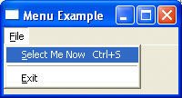
A menu widget is created as a child of the shell and set as the menu bar for the shell using the setMenuBar() method. Next, a cascade menu item is created as the parent for the File menu. A drop-down menu is then created as a child of the shell and associated with the File menu using the setMenu() method. Three menu items are then created as children of the drop-down menu (the second as a separator using the SWT.SEPARATOR creation style). The text of a menu item is set using the setText() method and the accelerator is set using the setAccelerator() method. To add behavior to the menu item, a selection listener is added in which a SelectionAdapter is created that overrides the widgetSelected() method.
| 