|
|
< Day Day Up > |
|
Recipe 5.1 Setting Styles for Input ElementsProblemYou want to change the appearance of input elements' background color. Such effects can take you from Figure 5-1 to Figure 5-2. Figure 5-1. The form without styles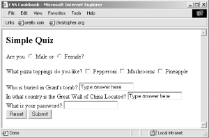 Figure 5-2. Styles applied to the input fields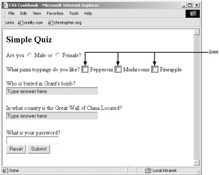 SolutionUse a class selector to design the input elements of the form: <h2>Simple Quiz</h2> <form action="simplequiz.php" method="post"> <p> Are you <input type="radio" value="male" name="sex" class="radioinput"> Male or <input type="radio" value="female" name="sex" class="radioinput"> Female? </p> <p> What pizza toppings do you like? <input type="checkbox" name="" value="l" class="checkbxinput"> Pepperoni <input type="checkbox" name="" value="mushrooms" class="checkbxinput"> Mushrooms <input type="checkbox" name="" value="pineapple" class="checkbxinput"> Pineapple </p> <label for="question1">Who is buried in Grant's tomb?</label> <input type="text" name="question1" id="question1" class="textinput" value="Type answer here" /><br /> <label for="question2">In what country is the Great Wall of China Located?</label> <input type="text" name="question2" id="question2" class="textinput" value="Type answer here" /><br /> <label for="password">What is your password?</label> <input type="password" name="password" id="password" class="pwordinput" value="" /><br /> <input name="reset" type="reset" id="reset" value="Reset" /> <input type="submit" name="Submit" value="Submit" class="buttonSubmit" /> </form> Then apply CSS rules to change the presentation of the input elements: .textinput {
margin-bottom: 1.5em;
width: 50%;
color: #666;
background-color: #ccc;
}
.pwordinput {
color: white;
background-color: white;
}
.radioinput {
color: green;
background-color: #ccc;
}
.checkbxinput {
color: green;
background-color: green;
}DiscussionYou can change the style of the active input field by adding the :focus pseudo-class. So, as a user fills out a form, the input field he is currently filling out will change color (see Figure 5-2): input:focus {
color: black;
background-color: #cf0;
}Opera is currently the only browser that allows radio buttons and checkboxes to be colored. Mozilla doesn't color them at all, while Internet Explorer for Windows ignores foreground color and colors the area around the widgets with the background color (as shown in Figure 5-3). Figure 5-3. Using :focus to light up an input field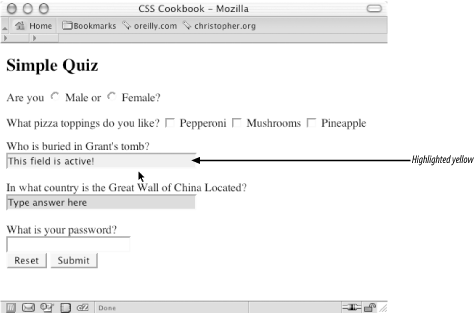 Rather than using class selectors as illustrated in the Solution, another way to stylize different kinds of input forms is through attribute selectors. For example, to style text inputs and password inputs differently you might use attribute selectors like the following: input[type="text"] {
margin-bottom: 1.5em;
width: 50%;
color: #666;
background-color: #ccc;
}
input[type="password"] {
color: white;
background-color: white;
}Although this works in most browsers, it doesn't work in Internet Explorer for Windows because this browser doesn't support attribute selectors at all. Attribute selectors currently work in Netscape Navigator 6+ and Opera 5+. If you want to ensure cross-browser support, you need to use class selectors to determine styles for different form controls. See AlsoThe CSS 2.1 specification for dynamic pseudo-classes at http://www.w3.org/TR/CSS21/selector.html#x33; the CSS 2.1 specification for attribute selectors at http://www.w3.org/TR/CSS21/selector.html#attribute-selectors. |
|
|
< Day Day Up > |
|